Good post with above title From economic journalist Noah Smith.
For you we will share some more from our old blog posts.
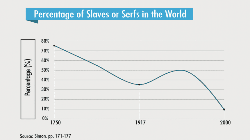
A suspiciously vague graph purporting to show the „proportion of slaves or serfs in the world“:
Debunking the so-called Human Development Index of each U.S. state:


What’s the worst graph they’ve all produced?:

Although this is not a “viral chart” at all. worst worst ever:

You can find other fun items by browsing the blog archives.